Amazon A+ Content Examples: 7 Premium Modules That Convert
Why Amazon A+ Content Examples Matter for Serious Sellers
Picture this: a shopper lands on your listing. The main image loads, but instead of scrolling past, they pause. A full-width video plays, hotspots glow on interactive images, and comparison charts line up side by side. That's the power of premium A+ content examples in action. Amazon A+ Content is visual storytelling at scale, yet most professional sellers stick to basic modules. They know A+ content exists, but few grasp what Premium unlocks: immersive, interactive formats that boost conversions by keeping eyes on your brand.
Seeing is believing. These amazon a+ content examples reveal premium a+ examples beyond text and thumbnails. Basic A+ content works for compliance. Premium A+ content sells. Let's break down the seven a+ content modules that top brands deploy.
1. Premium Full Image: Your Immersive Hero
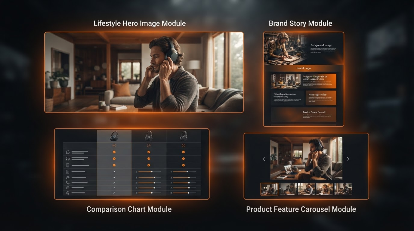
On desktop, it stretches edge to edge, a lifestyle shot of your product in real use filling the screen. Mobile? It adapts seamlessly, tapping into full viewport height without cropping key details. This amazon a+ content best example anchors brand identity from the first glance.
Strategically, it sets the emotional hook. Conversion psychology kicks in through immersion: shoppers visualize ownership, dwell time spikes, and bounce rates drop as your story takes hold.
2. Premium Full Video: Demonstrate and Build Trust
Desktop viewers see a crisp, autoplay video dominating the width, with play controls prominent. On mobile, it stacks vertically, thumb-friendly and auto-pausing on scroll. Perfect for product demos or testimonials.
Purpose: drive engagement. It works because video humanizes your brand, answers unasked questions, and extends session time, signaling Amazon your listing delivers value.
3. Premium Images & Text: Deep Dives That Scan Fast
Side-by-side high-res images pair with concise bullets on desktop; mobile reflows into a clean stack. Think feature spotlights with benefit copy.
It excels at education without overwhelm. Psychologically, scannable richness builds desire: visuals evoke emotion, text seals logic, guiding buyers toward Add to Cart.
4. Premium Comparison Tables: Shortcut to Yes
Desktop tables expand wide with columns for model variants; mobile collapses into accordions. Clean rows compare specs, sizes, prices.
Strategic edge: simplifies decisions. It reduces cart abandonment by clarifying choices, cuts returns through transparency, and lifts average order value via upsell paths.
5. Premium Hotspots: Spark Curiosity Interactively
Hover or tap reveals pop-up details on product images—desktop tooltips, mobile overlays. Pinpoints zoom on textures, ingredients, mechanisms.
Purpose: invite exploration. The curiosity gap pulls users deeper, fostering ownership and trust through hands-on discovery without page reloads.
6. Premium Carousel: Browse Your World Endlessly
Swipe or arrow through galleries on mobile/desktop, full-bleed images cycling user-generated content or variants. Arrows glow subtly for guidance.
Keeps shoppers in your ecosystem. It boosts time on page, exposes cross-sells, and converts browsers by mirroring infinite scroll habits.
7. Premium Q&A / Technical Specifications: Handle Objections Cleanly
Expandable sections with icons on desktop, tap-to-open on mobile. Bullet specs, FAQ toggles formatted for quick reads.
Closes sales by preempting doubts. Compliance-safe clarity reassures, turning skeptics into buyers with structured, authoritative info.
PeakForm Supplements: A Real-World Flow with Premium A+ content Examples
Take PeakForm, a supplement brand stacking five modules: Full Image hero shows capsules in a gym scene. Video follows, demoing daily routine. Images & Text dive into ingredients. Hotspots on bottle reveal sourcing. Q&A wraps with specs.
Flow: emotional pull to logical proof to objection crush. Shoppers journey from inspired to convinced, staying longer, buying more.
Patterns in Amazon A+ Content Best Examples from Top Brands
Leaders favor clean layouts, lifestyle over product-only shots, text under 20 words per block, brand colors throughout, mobile-first designs that flex without breaking.
A+ Content Before and After: The Transformation
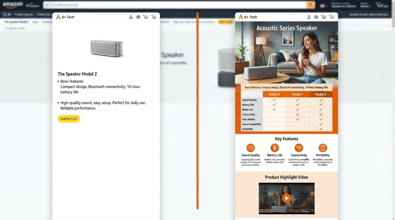
Basic A+ content: cramped text walls, tiny images stacked vertically, generic bullets. Feels like a spec sheet.
Premium A+ content elevates it: full-width visuals command attention, video injects life, interactives engage. Same product shifts from ignored to irresistible.
Forge Your Premium A+ content with A+ content Forge
A+ content Forge is your creative command center. Paste an ASIN, and it forges a draft of seven modules from real listing data. Desktop/mobile previews let you review before upload. Compliance desk flags risky language. ASIN to Premium A+ content in minutes.
Try A+ content Forge today and turn listings into conversion machines.