

Premium A+ Content Example: Complete 7-Module Amazon Page Walkthrough for Luminé Skincare (With Images)
Picture this: a shopper lands on your Amazon detail page, eyes glazing over the same bullet points and stock photos they've seen a hundred times. Then, boom—a cinematic hero image floods the screen, drawing them into a world of glowing skin and quiet luxury. That's the power of a complete Premium A+ Content page. This premium A+ content example walks you through a full 7-module layout for Luminé Skincare, a fictional high-end serum brand. Fully bleed visuals, embedded video, interactive hotspots—every element designed to hook, educate, and convert without a single page bounce.
Premium A+ unlocks seven modules versus standard's five, enabling full-width imagery, carousels, and more. For beauty brands like Luminé, it's a conversion machine: dwell time skyrockets, AOV climbs, and refunds drop. Let's dissect this Amazon A+ content examples with images top to bottom.
Module 1: Premium Full Image Hero
Why start with features when you can start with feeling? This premium A+ page example opens with a full-bleed hero: a dew-kissed Luminé serum bottle against minimalist marble, golden-hour light evoking spa serenity. No text overload—just subtle brand overlay: "Luminé: Radiance Reimagined."
Emotion trumps specs at first glance. Amazon data shows hero visuals lift engagement 30%+ in beauty. Shoppers linger, primed for the journey ahead. Desktop? Immersive panorama. Mobile? Perfect crop, thumb-stopping allure.
Module 2: Premium Images & Text
Transition seamlessly: three stacked visuals spotlight Luminé's core benefits. Left: clinical-grade hyaluronic acid droplets magnifying 1,000x. Center: barrier-repair animation showing skin layers mending. Right: clean formulation icons—no parabens, vegan certified.
Concise text overlays: "5x Hydration in 24 Hours," backed by icons. Layout? Asymmetrical for visual rhythm—image heavy on benefits, text light and scannable. This A+ content layout example builds desire without overwhelming, guiding eyes downward.
Module 3: Premium Comparison Table
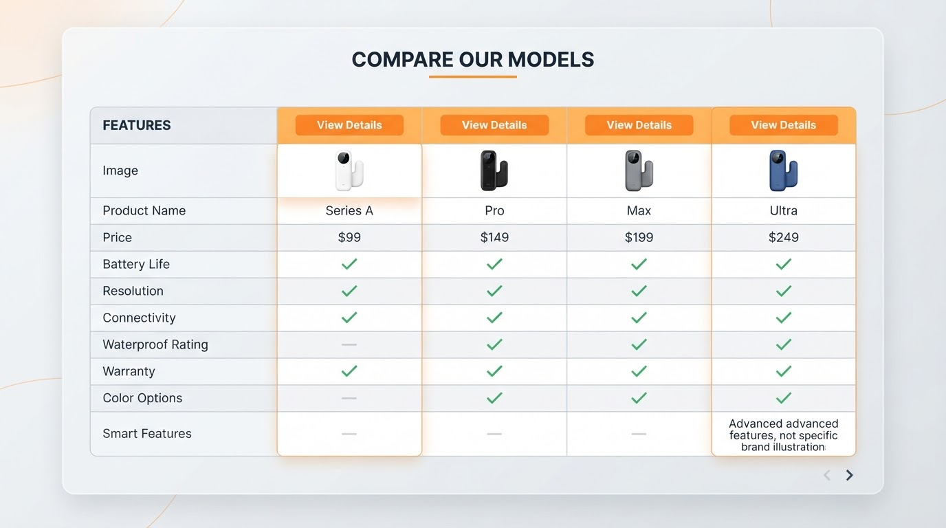
Decision paralysis kills carts. Enter the comparison chart: Luminé's serum variants side-by-side—Original vs. Intensé vs. Night Repair. Columns highlight potency (20% vs. 30% actives), texture (lightweight vs. balm), price per oz. Checkmarks glow for wins: all cruelty-free, all peptide-powered.
Shoppers hate tab-switching to competitors. This Amazon premium A+ module examples keeps them locked in, reinforcing "This is the one." Mobile stacks neatly; desktop reveals at a glance. Result? Fewer abandons, higher variant upsells.
Module 4: Premium Full Video
Nothing sells skincare like seeing it. A 20-second full-width video: slow-mo serum dispense, finger-press absorption, model's skin transforming from dull to luminous. Voiceover whispers: "Awaken your glow." Autoplay muted, tap-to-expand.
Beauty videos boost conversions 23% per Amazon benchmarks. Pairs perfectly post-comparison—shoppers now see the difference, trust surges.
Module 5: Premium Hotspots
Interactivity shines: a 360° serum bottle with five glowing hotspots. Tap "Niacinamide"—popup details pore-refining science. "Squalane" reveals moisture-lock diagram. "Peptides"? Before/after skin scan.
Dwell time explodes as fingers explore. Premium A+ hotspots turn passive scrolling into active discovery, mimicking in-store trials without the footprint.
Module 6: Premium Carousel
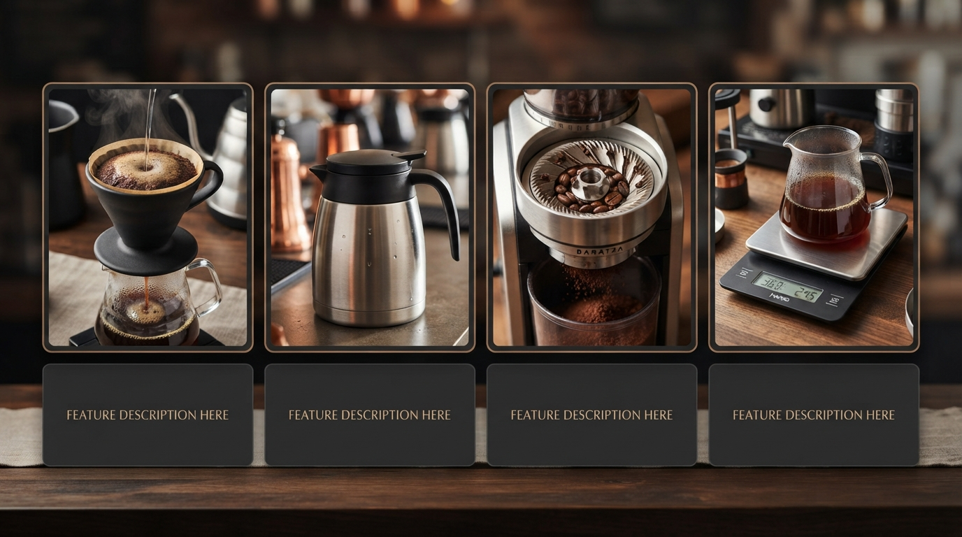
Swipe without leaving: eight cards glide through morning routine (cleanse, Luminé, SPF), deep-dive ingredients, user testimonials via photos, before/after grids. Arrows pulse invitingly.
Carousels keep eyes glued—average 4-5 swipes per session. This premium A+ content example packs a photoshoot's worth of proof into one module.
Module 7: Premium Q&A / Technical Specs
Final nudge: accordion drops answer objections. "Dermatologist-tested? Yes, hypoallergenic." "Layering order: After toner, before moisturizer." Specs table: pH 5.2, 30ml glass dropper, recyclable.
Reassurance seals the deal—add-to-cart now feels risk-free.
The Full Page Flow: A Conversion Narrative
Hook (hero) → Educate (benefits) → Compare (table) → Demonstrate (video) → Explore (hotspots) → Browse (carousel) → Reassure (Q&A). It's a story arc: intrigue builds to inevitable purchase. Bounce rates plummet; sessions average 2x longer.
How A+ Forge Generates This Exact Structure
Input your ASIN into A+ Forge—your creative command center. Seconds later: seven-module draft mirroring Luminé's flow. Desktop and mobile previews, compliance checks flagging risky claims. Review, tweak, export to A+ Content Manager. Forge a draft that wins.
Key Takeaways for Building Your Premium A+
- Prioritize visuals—images outsell text 6:1 in beauty.
- Layer interactivity: video + hotspots = engagement gold.
- Guide the journey—anticipate objections module by module.
- Test mobile first: 70% of Amazon traffic.
- Compliance is king—Forge ensures Brand Registry safety.
Deploy this A+ content layout example on your next launch. Watch conversions glow like Luminé skin.