
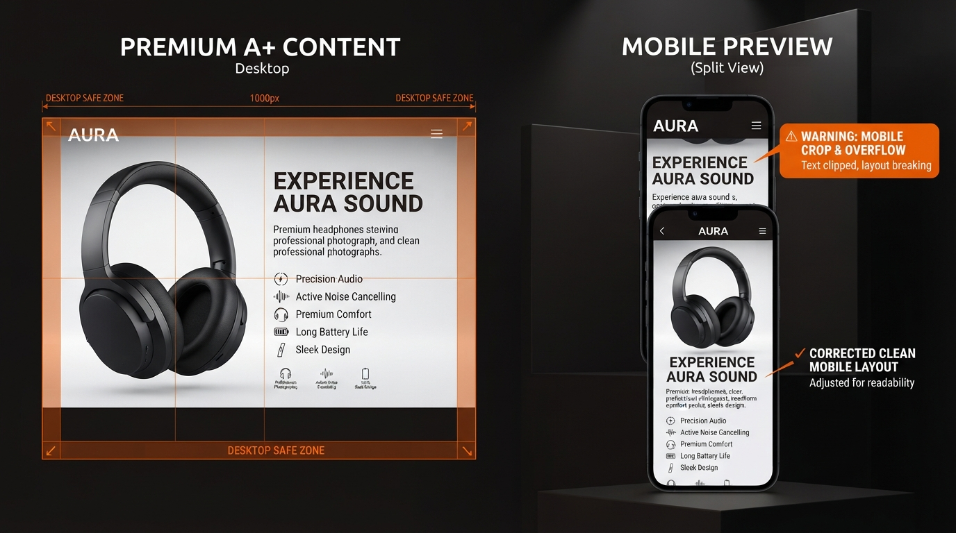
Premium A+ Content Mobile Image Text Safe Zone Cropped: Fix Amazon Cropping Issues Now
Picture this: your designer crafts a Premium A+ image that shines in Seller Central's desktop preview. Bold headlines command attention. Product shots gleam. Every pixel aligns. Then a customer pulls up your listing on their phone. Headlines vanish. Text turns illegible. Key product details crop out of sight. Sales stall.
This is not a dimensions problem. Your images hit the specs from our image size guide. The culprit? Amazon A+ mobile cropping. Amazon treats mobile views differently, often with separate Premium A+ mobile image fields and responsive crops that slice edges without warning. Fields vary by module, marketplace, and even account interface. What works on desktop fails on phones, turning A+ image text cut off into a workflow killer for Brand Registry sellers and agencies.
This guide arms you with a module-aware process to build Premium A+ safe zones. Verify before upload. Keep text readable on phones. Forge listings that convert across devices.
Why Desktop-Correct Images Fail on Mobile
Seller Central's desktop view tempts you to call it done. But Amazon renders Premium A+ content through phone viewports far narrower than your screen. Responsive design kicks in, cropping images to fit. The result: Amazon A+ text not readable on phone, edges shaved, headlines halved.
Complicating matters, certain modules use distinct Premium A+ mobile image fields. Crops differ per module type—comparison charts, hero images, ingredient lists. Marketplace rules add variance: US versus EU viewports shift slightly. Account interfaces evolve, altering previews mid-campaign.
One seller's perfect desktop module crops fine in US mobile but mangles in UK. Another sees text bleed in video modules but not standards. Ignore this, and premium a+ content mobile image text safe zone cropped becomes your reality.
Module-Aware Safe Zone Workflow
Treat each Premium A+ module as its own battlefield. Start by identifying those with unique mobile handling: hero banners, four-image-and-text, comparison tables. Keep proof points—product close-ups, key benefits—in the central safe area that survives most crops.
Shift dense copy from images to Amazon's text fields. Use visual hierarchy: large, bold headlines over tiny type. Always preview every module on a physical phone via Seller Central's mobile view before submission. Crops and fields vary, so live verification rules.
- Upload draft to Seller Central.
- Switch to mobile preview per module.
- Scan for cut-offs: headlines, edges, labels.
- Adjust central safe zone if needed.
- Repeat across marketplaces.
This workflow dodges Amazon A+ mobile cropping traps. No guesswork. Just verifiable results.
Safe-Zone Checklist
- Place critical text and product shots in the image center, away from all edges.
- Avoid edge-dependent layouts; test crop tolerance.
- Use font sizes that remain legible when scaled down 30-50%.
- Offload claims to module text fields, not images.
- Preview in Seller Central mobile view for each module and marketplace.
- Check on multiple phone models if possible.
- Confirm no A+ image text cut off post-adjustment.
Desktop vs Mobile Review Table
| Aspect | Desktop View | Mobile View | What to Check | Fix |
|---|---|---|---|---|
| Headlines | Full width, bold. | Often cropped left/right. | Readable in phone preview? | Center and enlarge. |
| Product Edges | Full frame visible. | Sides trimmed. | Key details intact? | Inset from borders. |
| Labels/Text | Crisp at full size. | Tiny or cut. | Legible scaled? | Move to text fields. |
Troubleshooting Cut-Off Headlines, Cropped Product Edges, Unreadable Labels, Missing Mobile Assets
Cut-Off Headlines: Amazon crops aggressively on narrow screens. Solution: Position in dead center. Test in live mobile preview. If still sliced, shorten or stack vertically.
Cropped Product Edges: Phones prioritize center content. Pull hero shots inward. Use negative space on sides as buffers.
Unreadable Labels: Small fonts vanish under scale and crop. Bump sizes. Prioritize: if it won't survive, shift to bullet text below.
Missing Mobile Assets: Some modules lack dedicated Premium A+ mobile image field uploads. Rely on responsive crop. Always verify; re-upload if fields appear post-update.
Preparing Separate Desktop and Mobile Visual Direction
Brief designers with dual briefs. Desktop: full-canvas storytelling. Mobile: compact, center-focused. Anchor product identity centrally across both. Never bury claims in images alone—echo in text for compliance. Reference our AI compliance checker and audit checklist.
How AMZAPLUS Helps You Review Before You Upload
Skip Seller Central guesswork. In the AMZAPLUS app, access the creative command center. Forge a draft ASIN to Premium A+. Get desktop and mobile visual previews side-by-side. Spot crops instantly. Run through compliance desk for policy alignment.
See examples and video specs via our Premium A+ video guide. Review before you upload. Build Premium A+ safe zones that hold on every device.
Your listings deserve this edge. Start now.